
- Solutions
Creative, Premium & Scalable Solutions For Web and Mobile App Development
Request Quote - Development
- Design
- Digital Marketing
- Hosting
- Portfolio
- Company
Professional mobile responsive design services by Saroma Solutions, Jaipur. We build fluid, adaptive websites that deliver flawless user experiences across all devices — smartphones, tablets, and desktops — for businesses throughout India.
Saroma Solutions provides expert mobile responsive design services from Jaipur, India, ensuring that your website adapts seamlessly to every screen size and device. Using CSS3 media queries, Flexbox, CSS Grid, and mobile-first development methodologies, our team creates websites that provide optimal user experiences across smartphones, tablets, and desktops — improving SEO rankings, reducing bounce rates, and boosting conversions for your business.
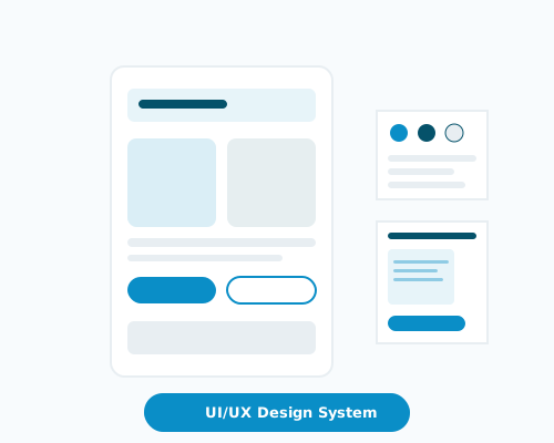
Our mobile responsive designs ensure your website functions flawlessly across all devices — from the latest smartphones and tablets to desktop monitors — passing Google mobile-friendly tests and meeting Core Web Vitals standards.
We implement fluid layouts using CSS Flexbox and Grid that dynamically adapt to different viewport widths, adjusting elements and content proportionally for optimal readability and user experience on any screen size.
All interactive elements are designed with appropriate touch targets (minimum 44px), gesture support, and mobile-optimized navigation patterns to ensure effortless usability on touch-based smartphones and tablets.
We optimize page speed through lazy loading, responsive images (srcset), code minification, and next-gen image formats (WebP, AVIF) to ensure quick mobile loading times that improve Google PageSpeed scores and reduce bounce rates.
Our responsive approach ensures users enjoy a consistent, seamless browsing experience with optimized content hierarchy, readable typography, and intuitive navigation whether they access your site on a phone, tablet, or desktop computer.
A mobile-responsive website design improves search engine rankings on Google mobile search, attracts more organic traffic from smartphone users, and increases conversion rates — essential for businesses targeting India's growing mobile-first audience.
Our front-end specialists build fluid, mobile-first websites using CSS3 media queries, Flexbox, CSS Grid, and modern frameworks. We ensure your website passes Google mobile-friendly tests, achieves excellent Core Web Vitals scores, and delivers seamless experiences across every device — with unlimited revisions and fast turnaround.

Every design starts mobile-first using CSS Flexbox and Grid, ensuring your site performs flawlessly on smartphones before progressively enhancing for tablets and desktops.

Get professional responsive design at competitive rates. One responsive website replaces the need for separate mobile and desktop versions, saving you ongoing maintenance costs.

Simple responsive pages delivered in 48-72 hours with unlimited revisions. We test on real devices and provide ongoing support to ensure your site stays responsive as content grows.

Receive Figma design files with responsive variants, clean HTML5/CSS3 source code, media query documentation, and breakpoint specifications for all target devices.
Our responsive design service delivers a website that looks and works perfectly on every screen size. From smartphones to 4K monitors, your users get an optimized experience that drives engagement and conversions.
Get Started Today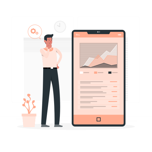
Our mobile responsive design workflow at Saroma Solutions follows a mobile-first methodology. From initial analysis to responsive testing, our Jaipur team ensures every breakpoint delivers an exceptional user experience.

We analyze your target devices, user analytics, and content priorities to define responsive breakpoints and establish a mobile-first design strategy.

Our designers create mobile-first wireframes and high-fidelity mockups in Figma with responsive variants for mobile, tablet, and desktop viewport sizes.

Interactive responsive prototypes allow stakeholders to experience the design on actual devices, validating touch interactions and content flow at each breakpoint.

We develop responsive layouts using CSS3 media queries, Flexbox, Grid, and Bootstrap or Tailwind CSS, ensuring pixel-perfect implementation across all screen sizes.

Comprehensive cross-device testing on real smartphones, tablets, and desktops ensures responsive behavior, fast loading, and consistent UX across Chrome, Safari, Firefox, and Edge.

We launch your responsive website with optimized CDN delivery, mobile performance monitoring, and Google mobile-friendliness verification for search engine compliance.

Ongoing responsive maintenance includes compatibility updates for new devices, performance optimization, and layout adjustments as your content and business needs evolve.
Saroma Solutions provides mobile responsive design solutions to businesses across multiple industries in India. Our Jaipur-based team ensures your website captures and converts mobile traffic regardless of your sector.






















Stay updated with the latest trends in web development, mobile app development, digital marketing, and technology to help your business grow online.
Loading...